COOK’S | REBRAND
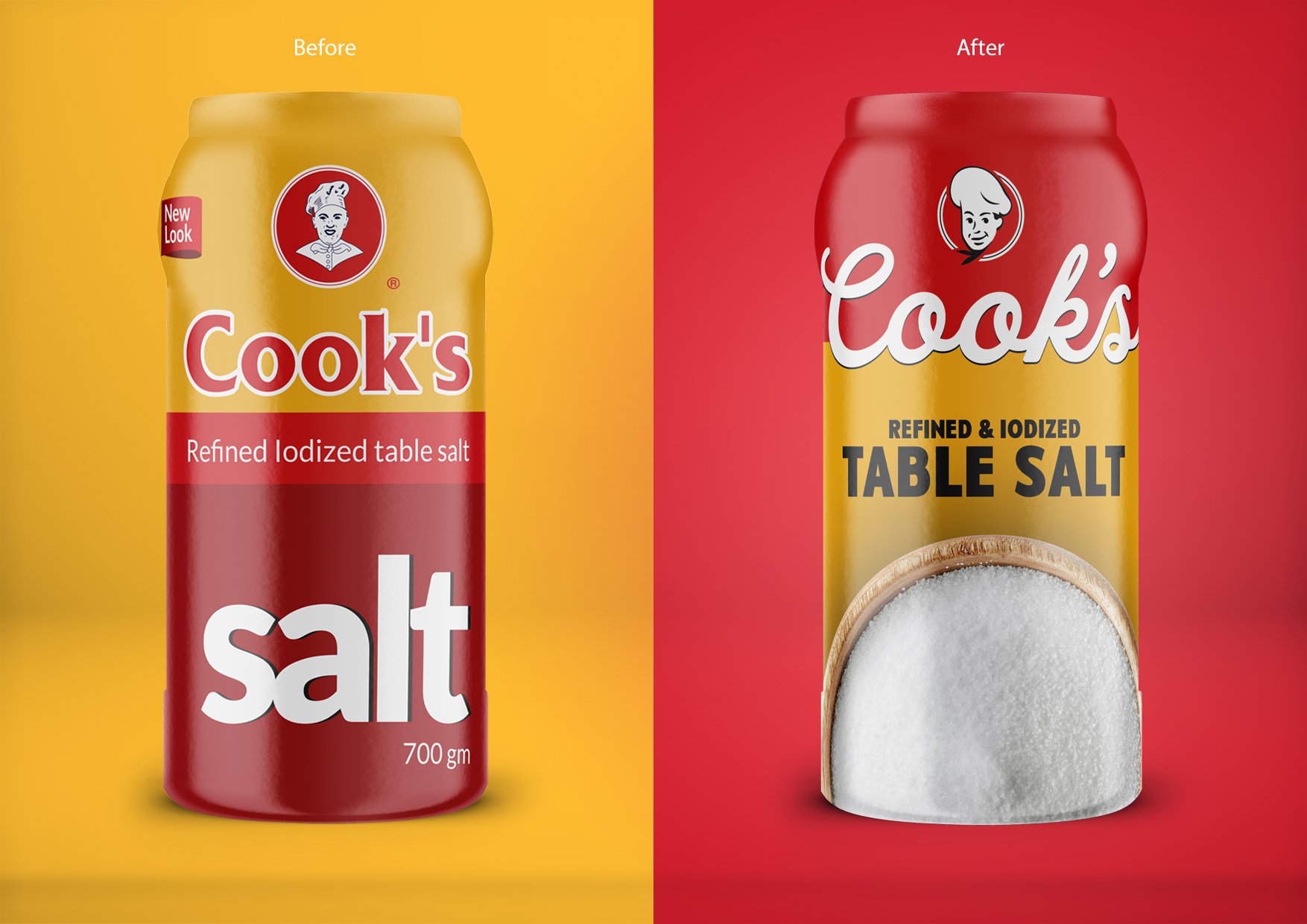
On Egyptian shelves for over 50 years, Cook’s enjoys a very strong heritage in the market, with the salt being the brands’ most recognizable product and the No.1 salt sold in Egypt. However, the brand lacked lustre and a modern look.
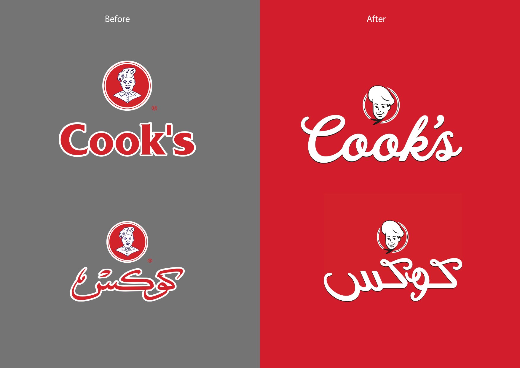
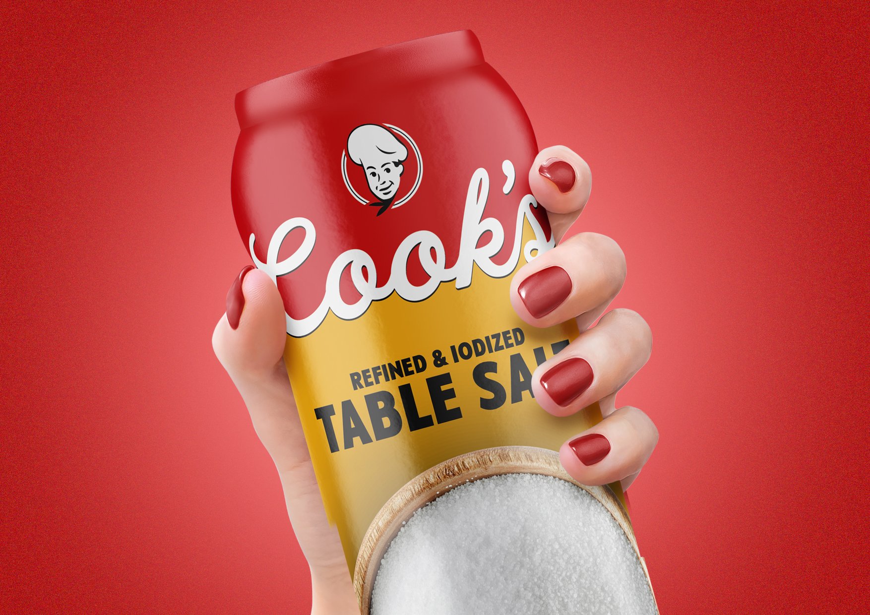
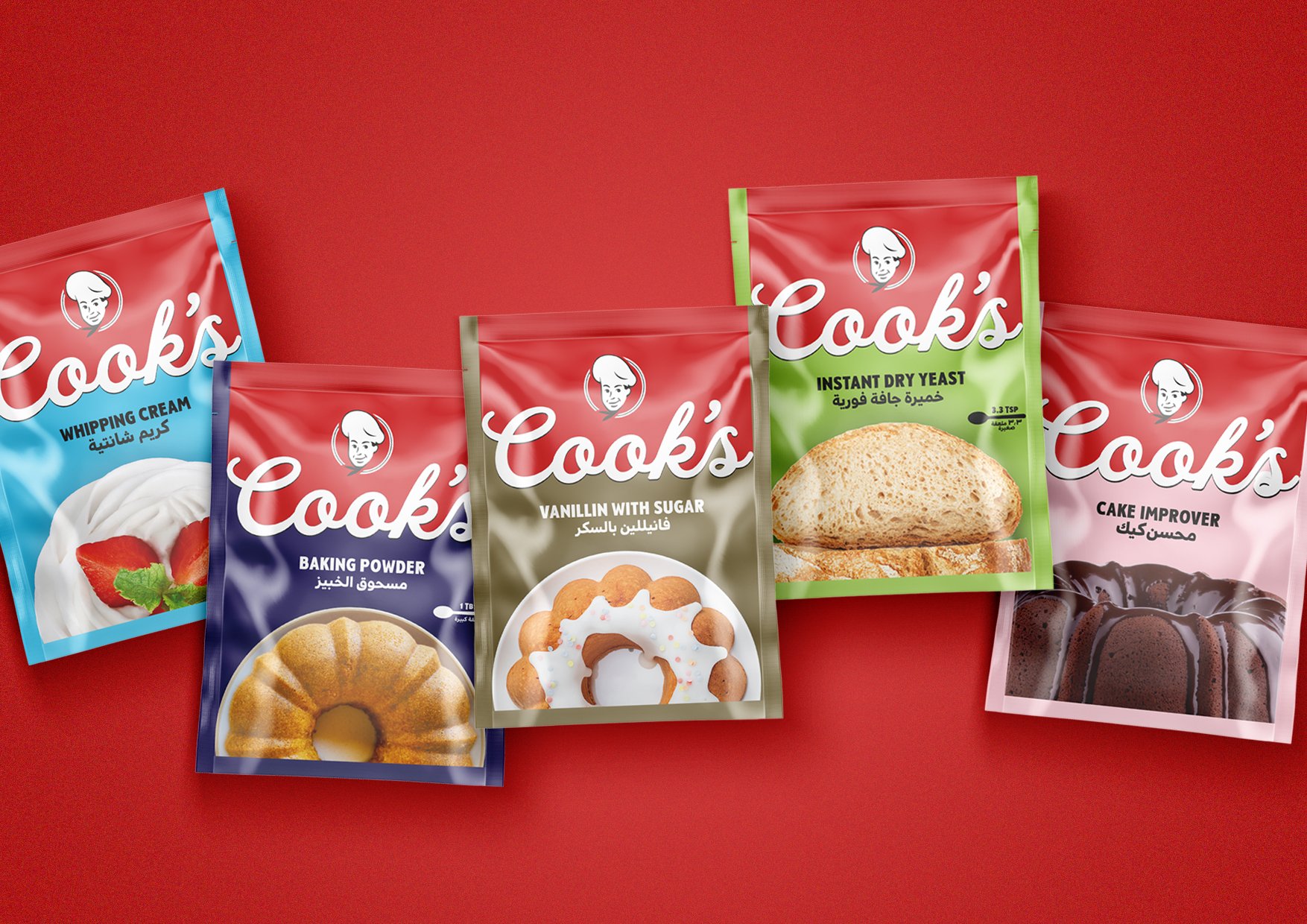
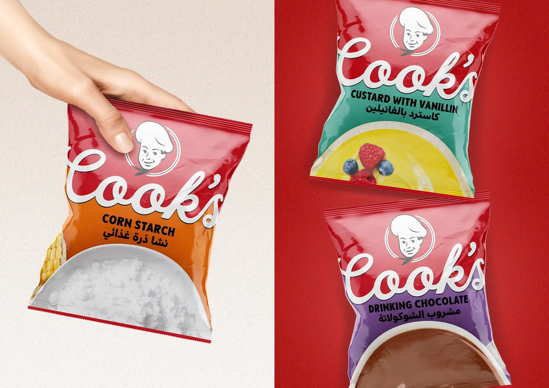
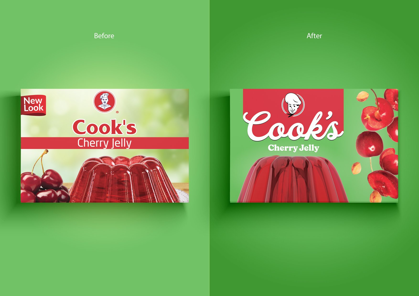
The rebrand strategy was to maintain some recognizable key elements (in particular the salts’ iconic yellow and red). First, the logo - and the cook - were given a fresh, approachable revamp, and the holding device paired with a clean, almost icon-like imagery strategy allowed Cook’s to venture into its new era.
CLIENT: Cook’s Egypt
YEAR: 2023
EXPERTISE: Strategy | Brand Identity | Creative Direction | Packaging Design | Logo
ILLUSTRATION: Mohamed Salah
