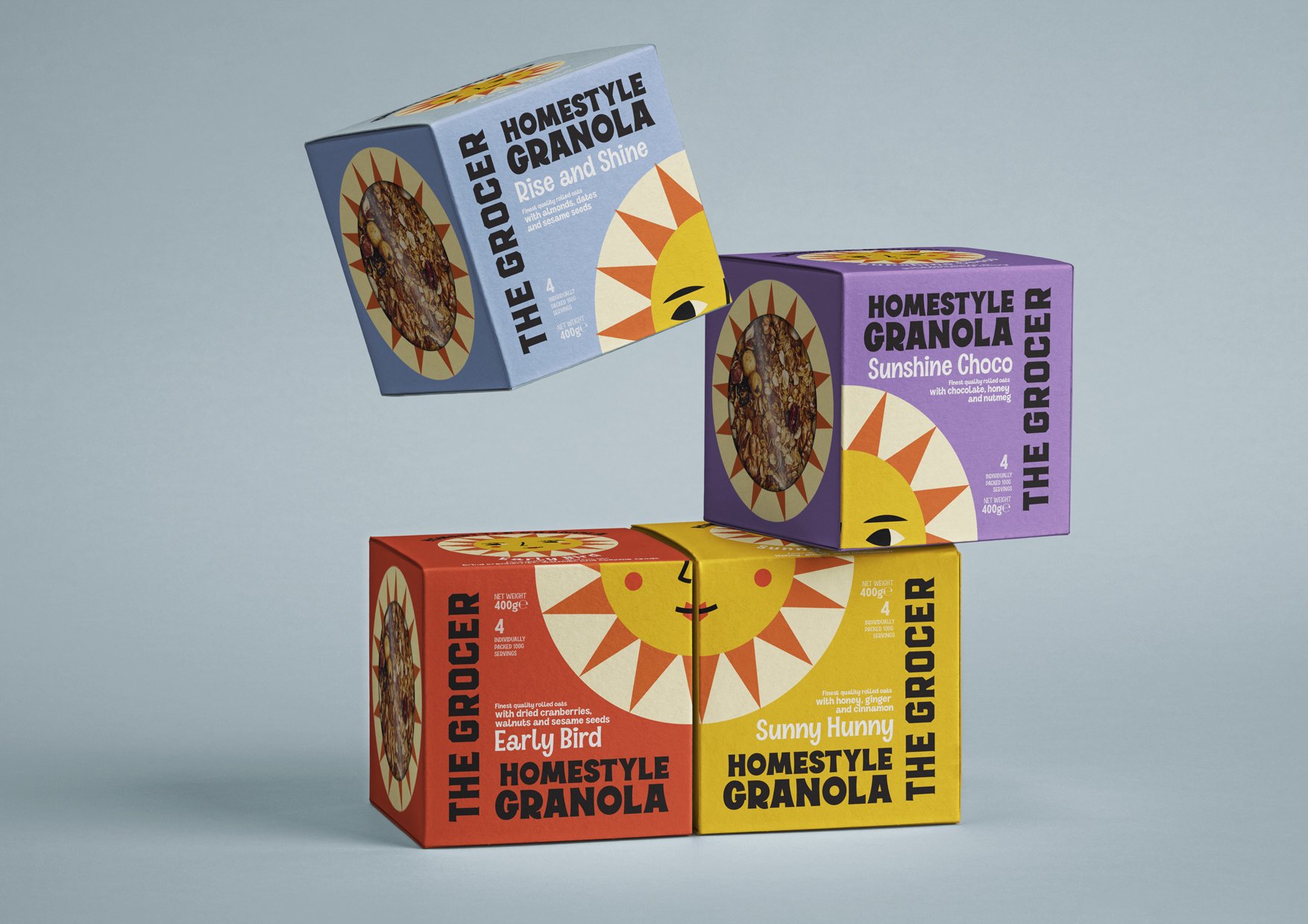
THE GROCER | selected packaging
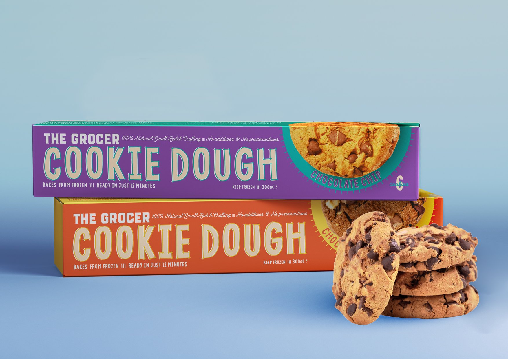
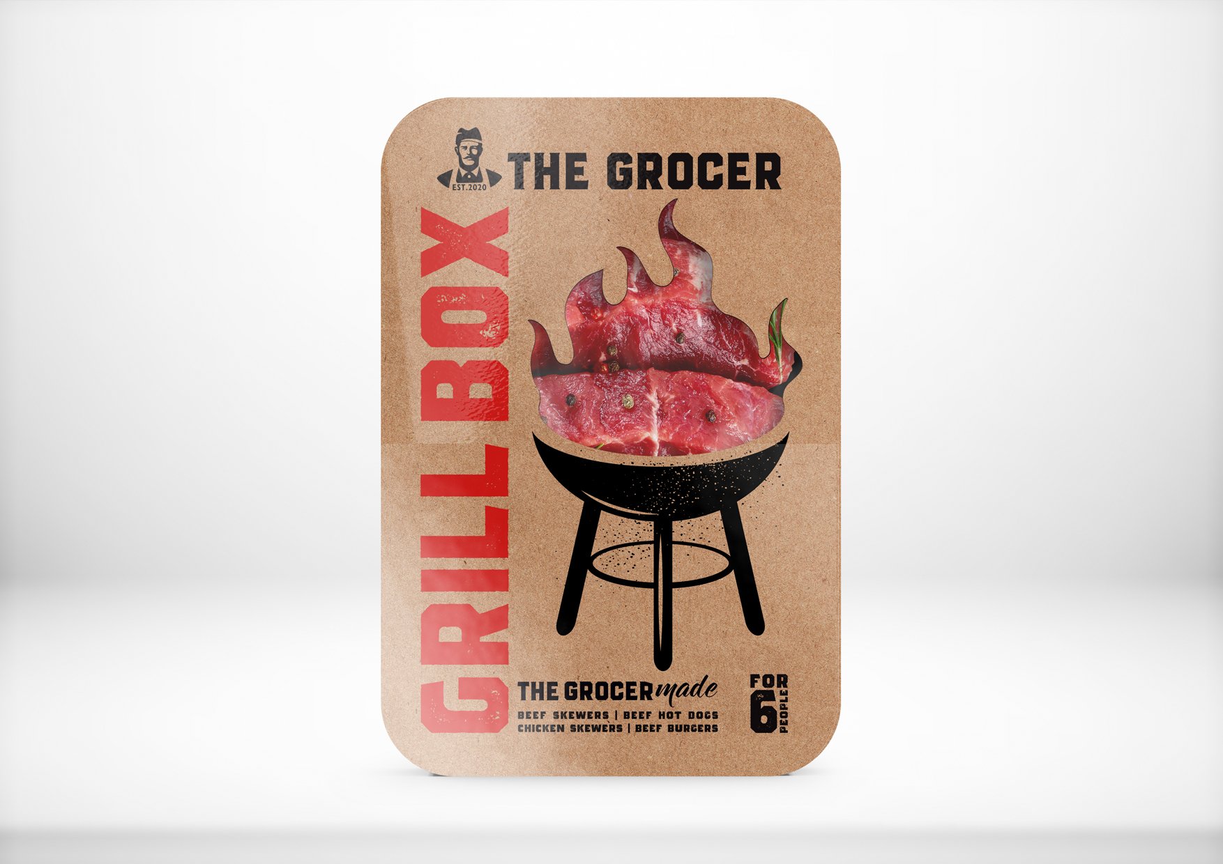
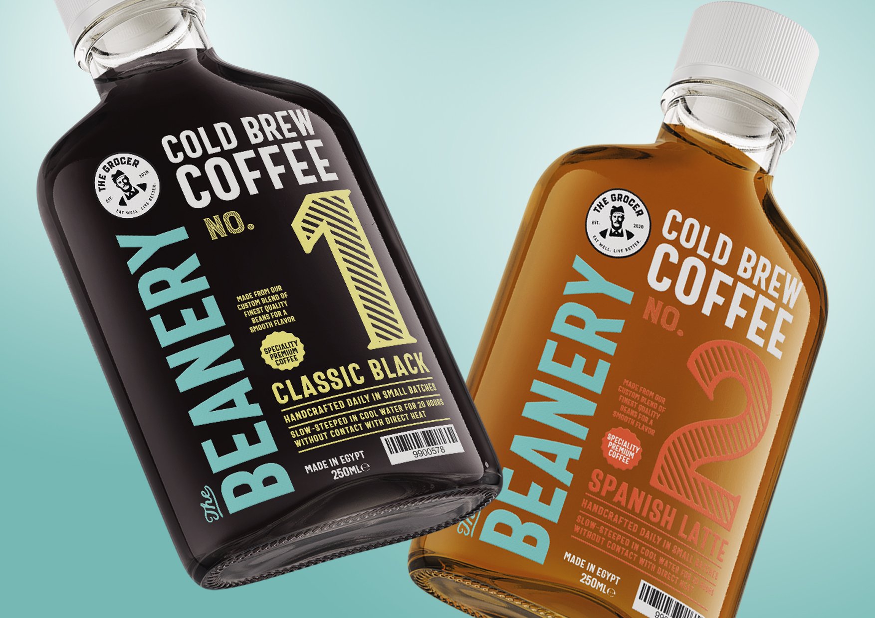
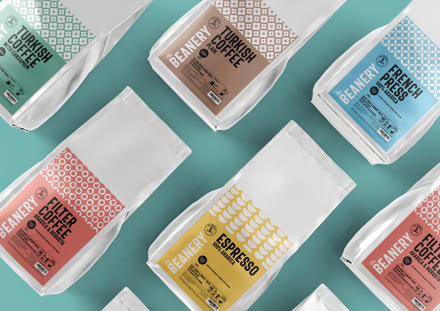
THE GOOD OLD DAYS. The Grocer approached me a year after their launch to create packaging for their White Label products. Building on their already established visual identity, I developed different packaging designs that highlighted the brands’ vintage name. By using retro fonts, imagery and colours (where applicable to the product), the brands personality was easily visible across many touch points.
CLIENT: The Grocer
YEAR: 2021 - 2022
EXPERTISE: Packaging Design | Brand Architecture | Creative Direction | Campaigns | Product Development | In-Store Branding

